
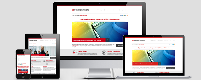
There are so many these days that talk about responsive web design but there are still a lot of people that do not actually know exactly what this actually means. Since you are here, you most likely do not know so much about responsive website design. In order to offer a simple definition, we are faced with a trend that uses tolls and resources to end up with a website that would look proper on any screen used by the visitor, ranging from small screen smartphones to HD monitors.
It is really important that you take advantage of all modern design options that are available in the event that this would increase the possibility of making a sale. With this in mind, the ecommerce site is obviously the best example of a site type that would benefit from responsiveness. It does not matter what device will be used to visit the site since everything will look great.
Based on what professionals from webdesignercheltenham.com say, the following advantages stand out as the most important ones you have to be aware of:
Responsive Website Design Advantages For Ecommerce Websites
Having A Flexible Web Site
The website that is built with the use of responsive web design can easily fit any screen used. In the past, websites were only used to reach desktop PC users. Since we see a huge emergence of portable and smaller devices, the designers now need to design something that is completely flexible. Viewing the site well with the device of the visitor’s choice in a way that is perfect will always be great for conversions.
Usability
Responsive website design automatically means that the site has a higher usability factor. This is one advantage that many do not understand. The visitor will find it so easy to look for what they want as there are many advanced features included when compared with precursors. Website features are visible. This is not possible with a desktop-only device because some parts would not show on mobile devices.
Cost-Effective
It is great to see that developing a responsive web site is a lot cheaper than developing different website versions since you only need one site to be created. We have access to many technologies and tools that the modern designer will utilize in order to create a site that will fit absolutely all screens. The design will automatically be more fluid since images and content will be adaptable and all this is got at really cheap prices.
Low Bounce Rate
One thing that many do not know is that having a responsive web design will automatically mean that your bounce rate will be lowered. This means that search engines will see your site as being of a higher authority. Fewer visitors will leave because of the fact that the design does look great, no matter what device is used for browsing. The professional designers will make sure that bounce rate is small through responsive design since navigation is really easy and usability is increased.
On the whole, it is quite obvious that responsive web design is necessary. Make sure that you always consider this.


