The time is coming to start thinking about the trends of logos, colors, and branding in general for 2018. So, today we will share everything you need to know about this subject, as it is for us tradition every year.
As you know, the corporate identity of brands and companies plays a very important role in communication with users and customers (both online and offline). For that reason, one more year, we did not want to miss the appointment and we have looked at the trends that will take the next months. Well, yes, we are going to do a small analysis of design trends 2018 for logo designs and corporate identity.
Why? Well, because we must know what “takes” to put our clients on the crest of the wave with their corporate identities and because it will not hurt to have a brushstroke in advance of what we are going to have to do for 2018 if we want our clients to continue surfing in that wave with the images of their brands.
It should be noted that although design trends change every year, there is something that always remains. The purpose of a professional design is to convey the message of the brand and create a lasting impression on the customer. And is that as we have said many times, a logo will serve to differentiate our brand in a more than the crowded market. So before you start working with your freelance designer, you must be very clear about what you want to convey with that design and how you want your clients to see you.
Whether you need a new logo, or if you are thinking of redesigning the corporate identity of your brand, knowing what is coming up strong in graphic design will help you in the process.
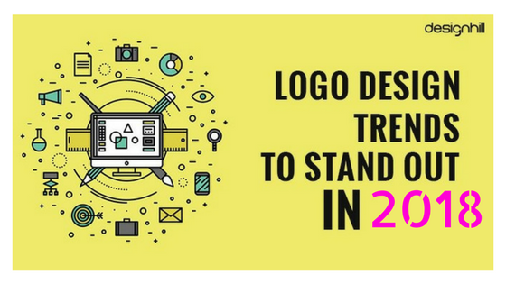
What trends in logos await us?
Some of the logos design trends of 2017 will continue to be effective throughout 2018 since the image of a brand does not change constantly. Even so, marketing is evolving rapidly, especially in the digital domain, so new ideas are emerging every year that respond to the interests of users.
Do you want to know what we will see in logo design for 2018?
Keep reading and discover our collection of trends in logos for the coming months.
Logos based on typography “San-Serif”
In all areas of graphic design, the use of sans-serif fonts, or dry stick, will be in full swing. That is typographies without endings or volutes at the ends.
Throughout this year, we have already seen some evolution towards this type of design, and in the next 2018, we can expect to see it among the logo designs of the best-known brands.
Hand drawn logos
It is one of the most used options in the corporate identities of brands related to cafes and restaurants. In general, it is a type of design closely linked to food. The handmade thing always has a warmth and a special closeness, the perfect lines are very good, but the “imperfection” of what is done by hand brings us closer to the design and its creator much more and creates links with the brands at another level.
But in 2018, we can foresee that this trend of logos will not be limited only to that industry. In addition, it will be used with both hand-drawn designs and pre-designed typefaces that resemble it.
Vintage trend logos
The vintage style arrived years ago and it seems that to stay, (yes, it’s cool). This style recovers those ancient airs but with a touch of modernity and clean lines that positions it directly at the forefront of trends. The fashion of vintage and Crest style has long since reached the point of branding, and little by little it has gone into the trends in logos. Throughout 2017, it has been reflected in the corporate identity of many companies. More and more brands are betting on this type of design because it indicates more personality and can easily adapt to brand values. In addition, it brings a touch close and humanizes companies.
Logos based on negative space
Playing with negative and positive spaces draws much attention from users since negative spaces do not usually apply much. However, it generates a clean and simple image.
Little by little, the brands have realized the utility of taking advantage of all the space, and it is one of the bets that come with more force.
Logos based on a line
Another trend in logos for 2017 is the use of the continuous line to make a complete design. These are complete logos that seem to be designed without lifting the pencil from the paper or with a few strokes, drawn so that at first glance they may look like one, and when you look at yourself better you see that it is made up of several lines.
Geometric shapes
Along with the trend of “lines” is also in vogue to use the geometry that gives a lot of game when making logos but we must bear in mind that it is one of the most exploited resources when designing brand images so … Be careful and be original !!
Conclusion
When working on the corporate identity of a brand, the most important thing is to take into account the values that it represents. The logo and the rest of the elements of brand identity must convey what that brand stands for, what its objectives are and what its commercial commitment is. Companies do not evolve in isolation, but interrelate with their communities (whether the target audience, suppliers, competition), so when choosing a design, they should take more things into account. When you think about what kind of logo you want for your brand, know the trends in logos, and know what is claimed by users today, it is decisive to choose one or the other design.