E-Commerce design involves more than just how the website looks and appears. It considers how it functions and the flow of elements from place to another, how it narrates a story, and how it evokes the mood. Everything from basic product images to nicely-placed CTA buttons can play a vital role in influencing a visitor’s decision of making a purchase from your website.
The world of e-commerce moves rapidly, and it is quite challenging to adapt to every latest and greatest trend. It is significantly critical to keep up with the changes that directly impact revenues, site design falls into that category. It becomes even more crucial to keep a constant eye on the design trends as online competition continues to grow.
The first important step for boosting your business is having a great website that can help to formulate and execute an effective marketing strategy. But having a working website is just not enough as the other crucial aspect Web Design works for your business for having a much more meaningful online presence. The success of your site depends upon numerous factors. Besides, an effective marketing plan, an appealing product, and an excellent customer service, you need a professional and great web design as well.
67% of the millennial and 56% of Gen Xers prefer shopping online rather than in-store. These millennial and Gen Xers spend almost 50% of time shopping online each week (6 hours) than their older counterparts (4 hours).
Top Design Trends to Make Your E-Commerce Site Engaging
An impressive website speaks for itself. A good design adds a subtle charm to your e-commerce site which urges customers to keep visiting your site. Here are some of the trends that can help you in crafting a site that drives revenues and provides a great brand experience.
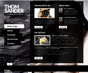
1. The Header
The Header is significant for two purposes. First, the logo, the most recognizable feature of the brand, is placed on the front and center. Second, the header features simple, easy navigation with a drop-down menu for shopping.
It is critical that the navigation bar is skillfully designed in a way that provides a definite path for your user. An effective navigation structure provides a convenient and easy path for returning customers to make fresh purchases while also providing guidance to relatively new customers browsing your e-commerce website. In addition to simplifying the user experience, intuitive navigation system allows search engine index rank all your important pages.
2. The Effective Use of Photography
Ideally, photos should be the centerpiece of the attraction of your site, starting with your home page. It has been observed that high-quality photography has taken preference over product lists. In the present era, every element of content is masterfully designed around pictures. It catches and keeps your visitor’s attention as customers have become familiarized of scrolling through pictures on Instagram and Facebook.
The concept of knolling has gained a lot of popularity, especially for retailers. This method is used when objects are laid out in a symmetrical manner and captured from above without even using a model.
High-Resolution photos along with great web design are the two vital ingredients you should target I you want to capture the eyes and mind of the reader. People hardly retain 10-20% of the information they read. However, if you combine the same information with a relevant image, they are likely to remember almost 75% of the information.
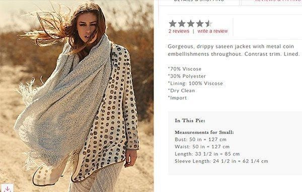
Free People is one good example of the correct combination of text and image. They have eye-catching and modern product photos. They would normally come up with a lot of offers and products grouped in numerous categories. The business ensures pictures are constantly updated to give a new vibe every time a visitor sees it.
3. Minimalist Menu Items
In the present era, less is more when it comes to modern e-commerce design trends. An extremely large, over-size, and an expansive menu that runs all over the page with 15 rows per column is a relic of the past. A sophisticated and less cluttered menu with fewer options portrays customer a superior level of quality and authenticity. A means that eats up an entire smart-phone screen leads to an irritating and frustrating customer experience that hurts traffic and conversions.
If you are a business that sells a large variety of products, find a professional way to organize that into a reasonable number of categories. It is the tendency of the reader to take a deeper dive into specific sections if they want to see more offerings. The ultimate aim of your site should be to provide an enjoyable experience for the customer that will increase engagement and time spent on your ecommerce site.
4. Quick Interaction with Customers- Live Video Sessions
A popular trend has been in the upsurge. It is to attract and entice visitors towards the brand via live video sessions where the customers can communicate their desires and business can show up a product or service that matches that wish list, resulting in buying lifetime customer loyalty.

Sophie & Trey is one of the fast-growing online boutiques that is full of a variety of clothing for women. The store has been instrumental in making high levels of user engagement. They have come up with an option of having a live video session with their customers. This has enabled customers to directly interact with a specialist and can easily convey their requirements, making it quite easy for the business to understand the dynamics of their clients and come up with a solution to fulfill the desire of customers.
5. Smooth Checkout Process
It is extremely significant to make the checkout process as easy and intuitive as possible. The positioning of CTA (Call to Action) is vital. It is important to place the CTA on top of the screen in the conversion path to attain maximum possible visibility.
Pull customers to the checkout page when they are going through the reading content, not necessarily only when they are in shopping mode. This has become easy now with the help of Embeddable anywhere Buy Buttons. These buttons have proven to be quite precious as they facilitate the shoppers to buy directly from the e-commerce site.

Amala, a beauty blog illustrate the importance of the correct positioning of CTA. It also broadcasts the presence of buying buttons, help visitors with quick purchasing decisions for their desired items.
Quick Recap
When you sell exclusively online, making sure all customers have an exceptional shopping experience isn’t as simple as onboarding a friendly retail staff or greeter to welcome them as they enter the door. The website is the face of your business and the first point of interaction with your visitors. The designing part of your site holds the key to success in the modern world of e-commerce. Bad user experience is a killer for e-commerce. The ultimate goal of an e-commerce site is to attract and convert customers. If you want to boost your site, present customers with a smooth user experience.
[ABTM id=7495]